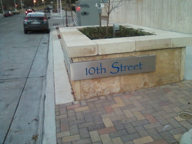
Now, you know me. I’m as proud of Austin as the next guy. But correct me if I’m wrong, but isn’t this Austin street sign in papyrus font? I mean seriously, that’s only a half step above comic sans.

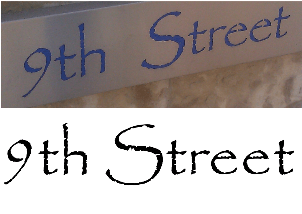
There’s a bunch of these on street corners around downtown. If you’re going to go the trouble of cutting letters into steel for a public works project, you would think you could get a font that wasn’t the second-most hated free font in the world. It’s the exact same font that came with my open source GIMP program. Check it out, most of the fake scroll notches in the letters are identical:

Mr. Bey, you are correct. Papyrus is the eye sore of type. Some would argue that its allowable, in my opinion, it should be wiped off the face of the earth. In fact, I have come up with an idea. We need to create a virus that removes Papyrus from all computers. We could call it the “Papyrus-virus” or “Pa-virus”. Either way, the virus will be created in hope of making the design world a more beautiful place…